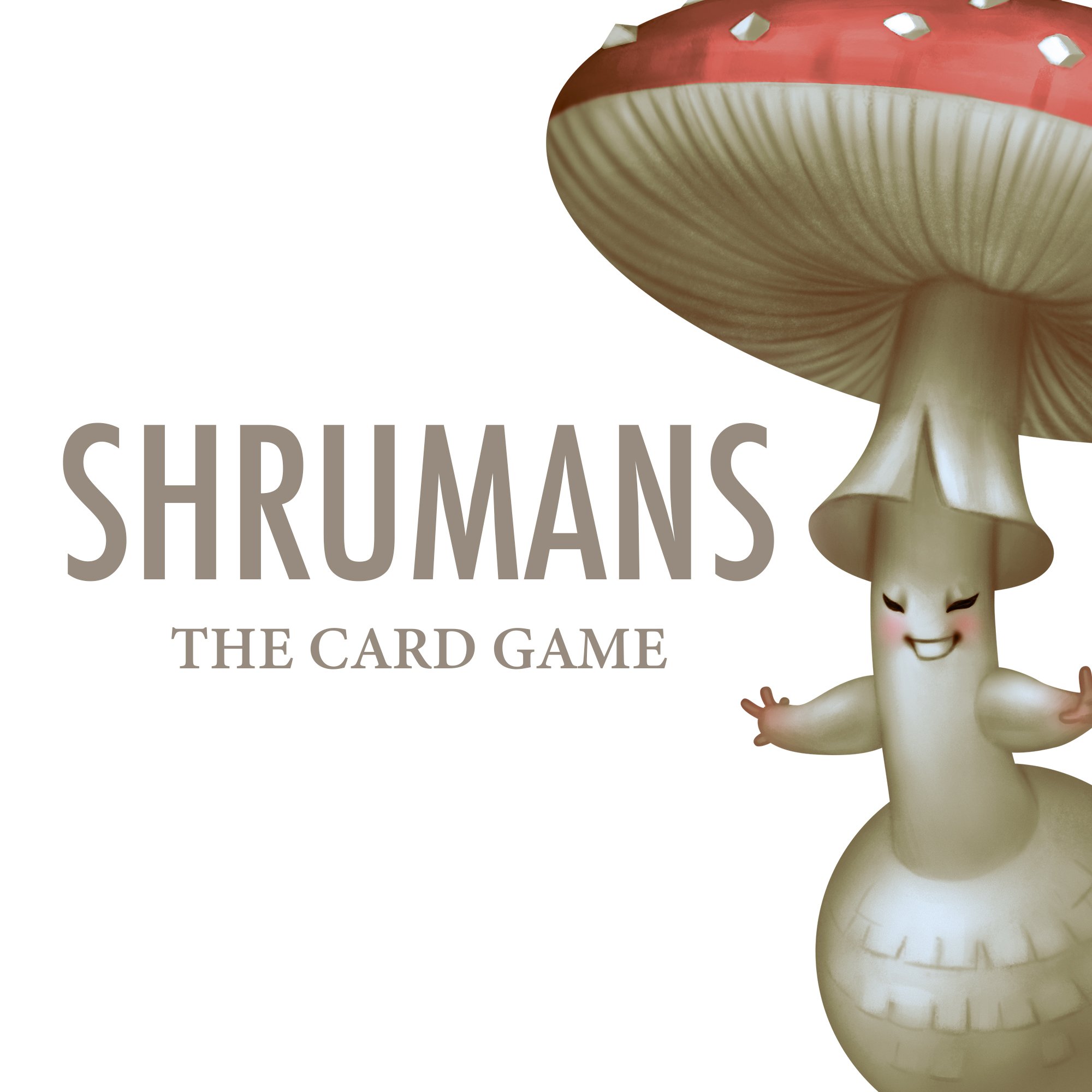
Shrumans Game Testing Review

Game testing at Diversions Tabletop Game lounge was a success! The tables were full and some groups even played multiple rounds. It is the best feeling to see people enjoying themselves and the feedback was incredible. I collected feedback forms and most were filled out completely. The Diversions attendees were on a mission and tabletop gamers don't hold back!
Here is a general sense of the feedback I received:
ACTION CARDS
Need more for variety and better interaction with other players
Some action cards like Parasitize have too much power. Make sure the action cards are balanced so a player does not have an outsized advantage
Add clarity to Actions
ECOLOGY CATEGORY
Each Shruman card has an M, S, or P in the bottom, right corner that represents the ecology, which is the fancy scientific word for how mushrooms get their nutrients. These letters stand for Mycorrhizal, Saprotrophic, and Parasitic.
The purpose for the Ecology category was kind of confusing for players. It is not a category for creating sets, but has a small role in bonus points for P cards. This category needs a major rethinking to make sure M, S, and P all have a purpose. The solution I have in mind is an action card that is a "Discard 2" based on the Ecology, which will give players more opportunities to draw and build sets.

GENERAL FEEDBACK AND ENDING THE GAME
More clarity is needed for the instruction cards
The way the game ends needs more structure. In the current iteration, the game ends when the draw pile runs out, but only after the "Forage Pile" (a second draw pile) is shuffled back into the draw pile. There is some confusion on when that happens and what to do with remaining cards in hand.
After this game test, the revised game play is close to 80-90% completion. There will be another game test with the completed art so stay tuned on how you might be able to help with that!
Now is time for me to finish all the card art! Please share about Shrumans and encourage friends to follow me on social media! Having a following helps on the crowdfunding side when we eventually launch on Kickstarter.
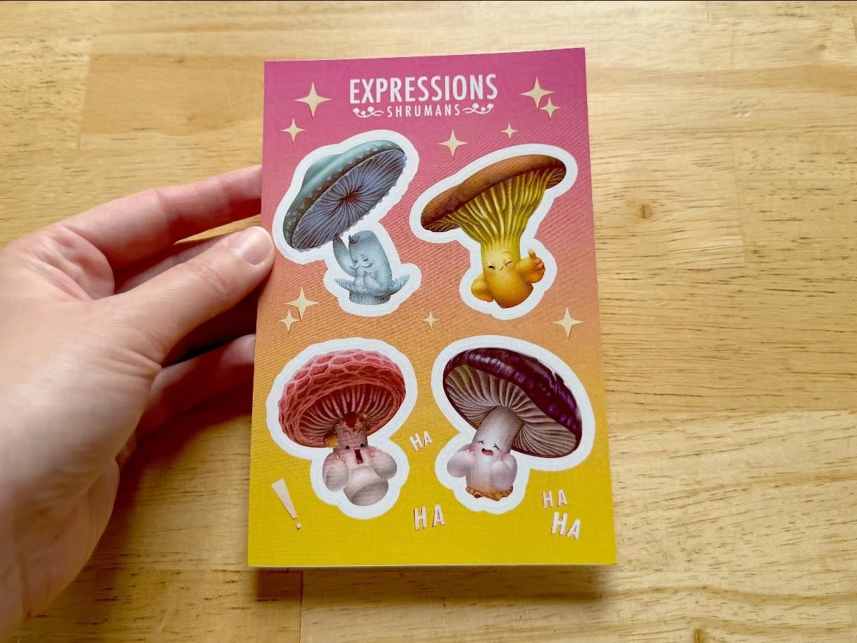
New Stickers are Here!

Stinkhorn Shrumans can now be enjoyed in sticker form along with a holographic set of Shrumans "Expressions"!


Find Stickers on my store!