Fall Markets: Support Your Local Artists!

FALL MARKETS: SUPPORT LOCAL ARTISTS!

Fall came out of nowhere and here we are with pumpkin beverages materialized in hand. You’re tired of the overly-processed versions of Fall flavors. You want the real thing! Enter your local holiday markets, fairs, and conventions.

This year I will be vending with ICON for the first time in October, which in this case is a half-season mini con. The vendor hall is at the Masonic Lodge with ICON events the night of October 10 and all day October 11. The vendor hall will be open from 11am-4:55pm.

There will be other locations for events in the surrounding walkable area of downtown Iowa City. October 11 also coincides with the Iowa City Book Festival at Merge! Both events are free to the public, but there are ICON panels and activities that are available with purchasing a con badge ($25 for adult and $2 for kids).

More information on ICON 49.5 here!

I am putting the cart out before the horse a little bit for this Holiday Market. To be clear, the Parks & Rec Holiday Market in Iowa City is definitely happening, but my spot hasn’t been guaranteed yet. This is a great local market with unique crafts and goodies that tend to get buried in online search engines. You should go regardless if you are in the area!

Even Etsy has become suspect for mass-produced items and generative AI that is cleverly marketed to look like artisanal goods. Support your local artists and craftspeople by going out to your local markets and fairs. You will find something truly unique and get to know real people!


SKETCHES

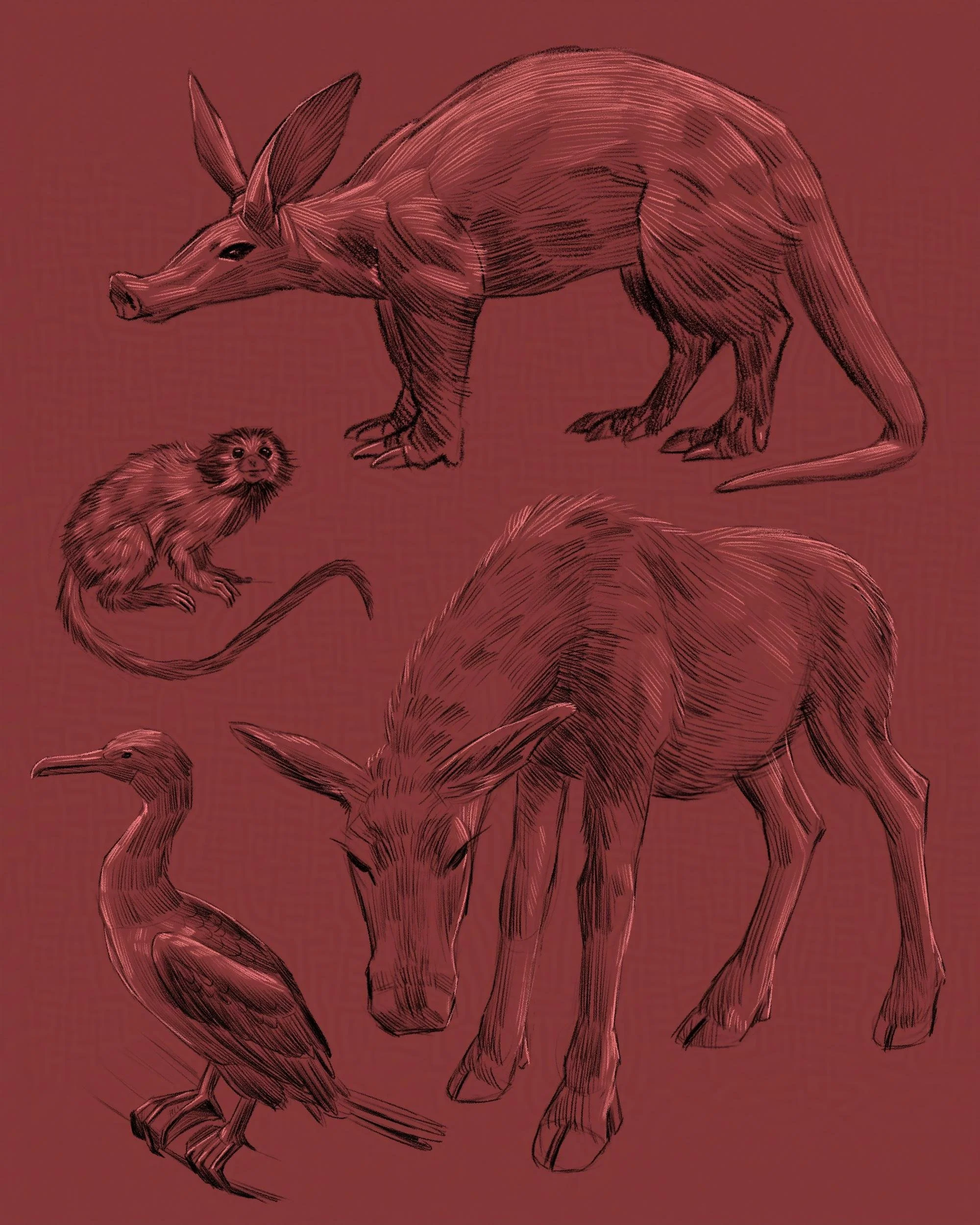
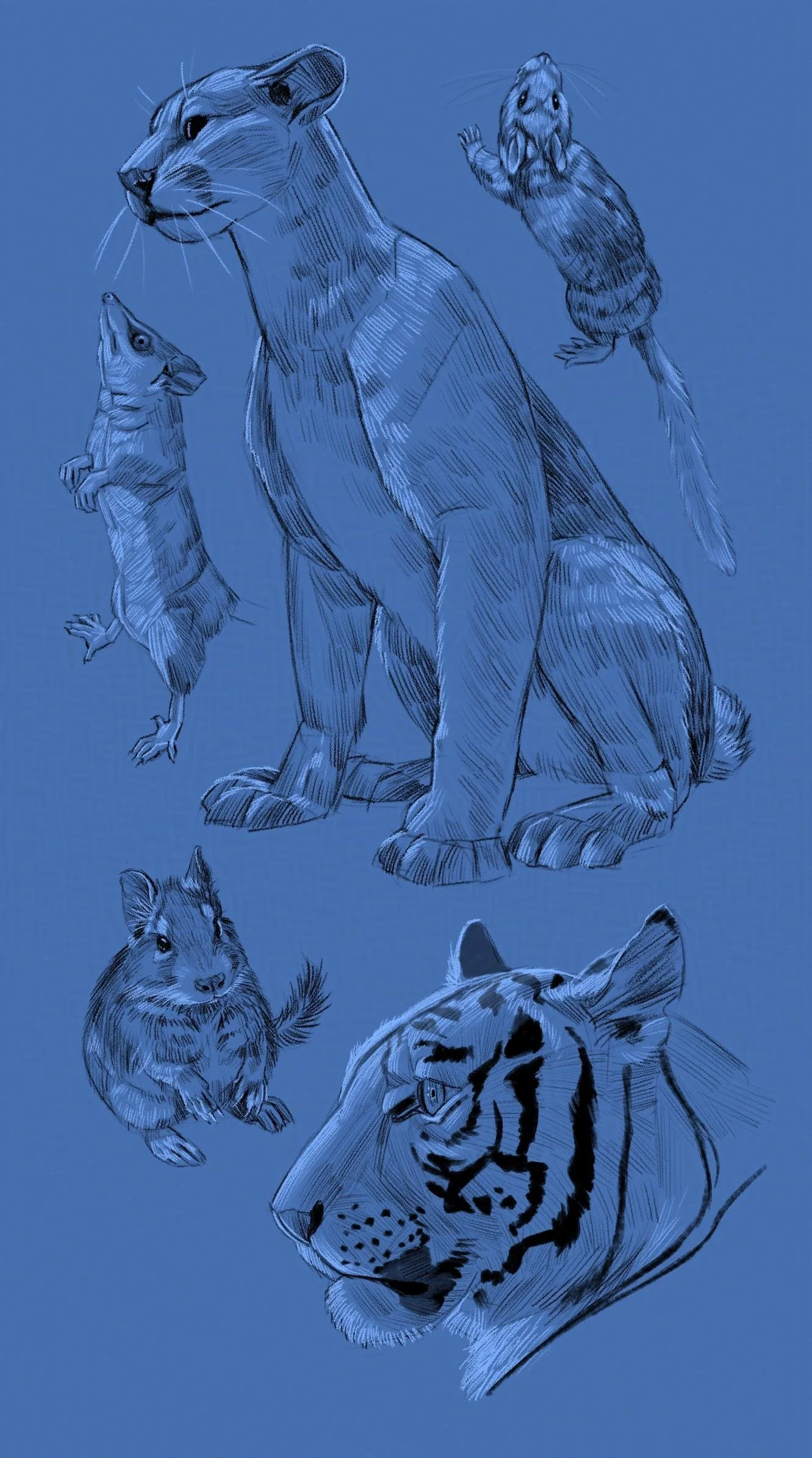
Here are new animal sketches from the past month to enjoy! I have been spending some time at the Iowa City Museum of Natural History, which has an amazing taxidermy collection open to the public.

New Book Covers

We won't have a deep dive this month, but a major artwork update that I hope you will enjoy! Here are new covers I designed and illustrated, soon to be published as well as their concepts. I am working with a slew of genres, so I have included that info for the sake of comparison. 

I love designing motifs and shiny things; lucky for me I had both for Buddy the Night. The motif frame provided a classic fairytale look that was perfect for the teddybear knight. 

Genre: Middle Grade Fantasy

Clash of Crystals also uses a framing element like Buddy the Knight. The novel is a little bit of "Avatar the Last Airbender" meets "Hunger Games". That plus the references to graphic novels in the story led me to channel my inner manga-ka and use graphic elements and linework. The anime room in my heart never left me. :)

Genre: YA Urban Fantasy (Trial, Dystopian)

Mists of Mbali has elements of realism along with mysticism and magic. It was important to highlight the protagonist's eyes and hint at other magic elements.

Genre: YA/New Adult Urban Fantasy

Illustrating Wings and Dynamic Compositions

I am happy to announce that my "Cover Story" exhibit that was up at Artifactory is going to have a new location! It is moving to Pappajohn Biomedical Discovery Building (PBDB) on the University of Iowa Campus. The art will be up from November 8 to March 1, 2024, with the building accessible to visitors from 7am-6pm Monday-Friday. This is a beautiful location on the skywalk between buildings. They even have a Java house in PBDB so you can grab a coffee while browsing. There will be a short reception on Nov 16 from 4:30-5:30pm. All are welcome!

With all of the busyness this year, I did not get around to sharing one of my favorite covers. It's a YA fantasy with bird people and dragons. What's not to love? I will share how I refined this composition to make it more dynamic and how I utilized reference material for believable wings. 

Below are the preliminary sketches featuring two of the main characters. It was a no brainer to include a dragon and it was also important to show the relationship between the two characters. That narrowed down the scope of possibilities, which is helpful when you have a hundred directions to go in for a book cover.

We went with the third sketch which has the best narrative clarity showing the two characters preparing to fight the dragon. It also illustrated the spirit world from the novel in the top part of the composition, which gave it an advantage over the other two. 

For this cover, I branched out to explore expressive glyphs in the title font. There were also key elements in the composition to utilize for overlap effects, such as the floating shapes. I made an effort to give the title some effervescence by using loopy letters that complimented the wispy background. 

With the concept phase completed, I set out gathering my usual reference material for all parts of the illustration. I use indirect reference for nature-based content, like wings. Keep in mind that wings are just big flappy hands, which is a helpful basis for anatomy and disturbing thoughts of chicken people. 

Above is my page of reference just for wings. I look up the birds that the figures are based on and use a flying fox for the dragon wings. Pro tip is to use big bats instead of small bats for dragon wing reference as the proportions and physics will be closer. Big bat wings are really bendy under all that weight and the anatomy is easier to see. Also they're cute, so treat yourself.

You might ask why I have so many bird wing references? This is because there is no perfect reference wrapped into one image (unless you pose a model or maquette), so I have one photo that gives insight into back-lighting, another for the general pose, and then one photo might be perfect for just one of the wings. 

These are the 3D models I used for the figures and the dragon. This gives me the best information for lighting, anatomy, and perspective. It's not the perfect reference, but I can synthesize it with my reference photos of real animals to get the right balance of realism and believability. Both of these models are from Daz3D, which is my go-to for people especially because I can pose quickly and customize faster than models built from scratch. 

Here is an annotated version of the characters to help you understand what I take or don't take from the reference image. I am making comparisons to the cover sketch of the figures and decide what is a helpful improvement and what should be disregarded in terms of lighting and pose. Most of the reference from this image is adopted, but the poses of the hands are not naturalistic. I take some photos of my own hands, which gives me better reference. 

That's about half of my reference material for this book, so there is even more where this came from. Good, accurate reference material is your friend!