Forest Friends and Website Store Launch

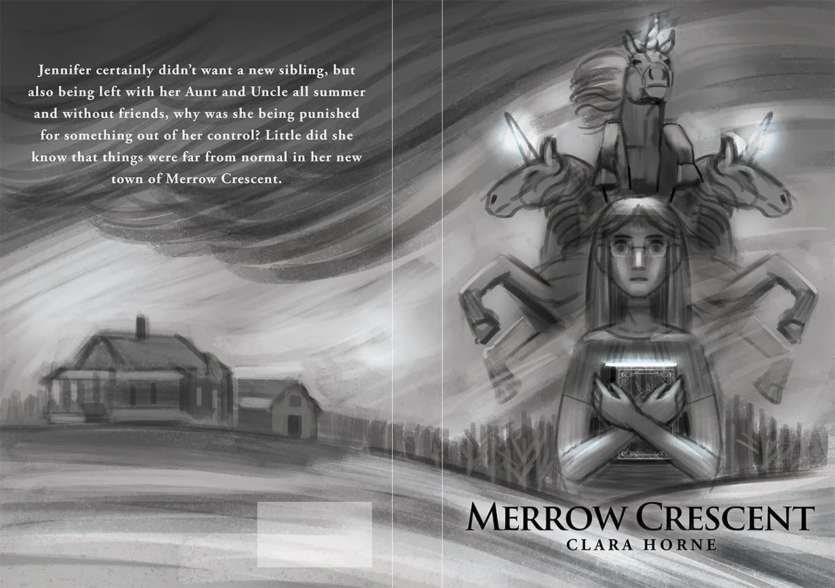
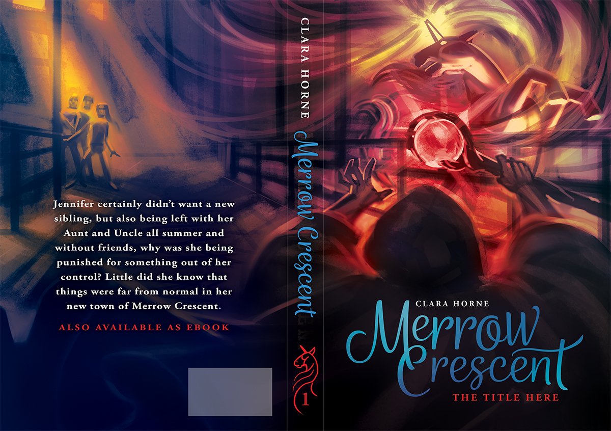
One of my goals is to create more art that is part of my own creative vision, characters, and stories. Although I love working on book covers, there are some constraints with subject matter and designing for marketability. After doing some art with animals, I realized that they provide a certain freedom that I don't find with figurative human-based work and are a great jumping off point. Expect more forest friends in the near future!

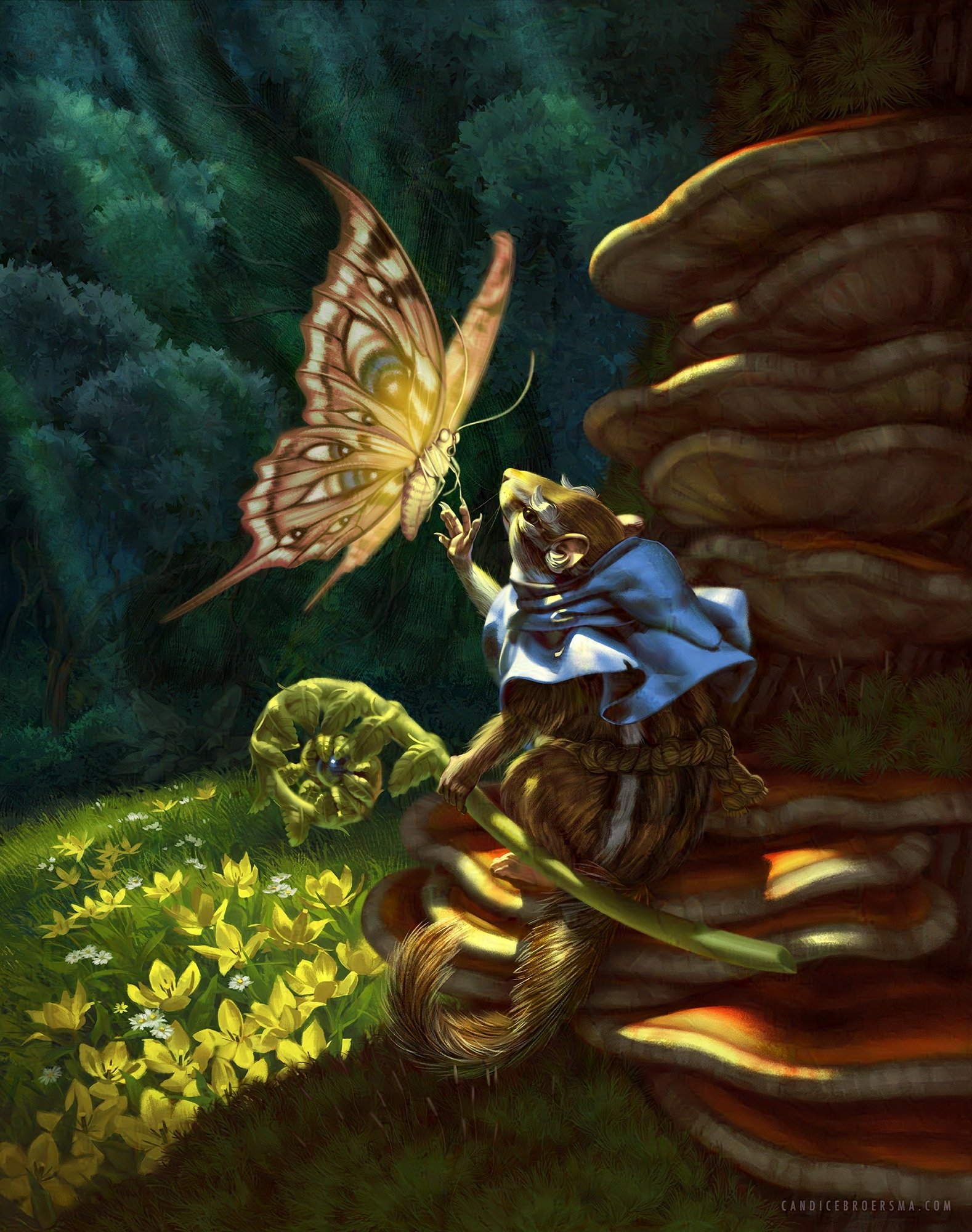
 "The Messenger" has a silly origin story, but more depth materialized as I worked on it, both for the character and the environment. It started from the desire to visualize the word-play of chipmunk with chip-monk. From there I wanted to create a feeling of hope and the stories of saints being visited by heavenly beings found its way into the narrative.

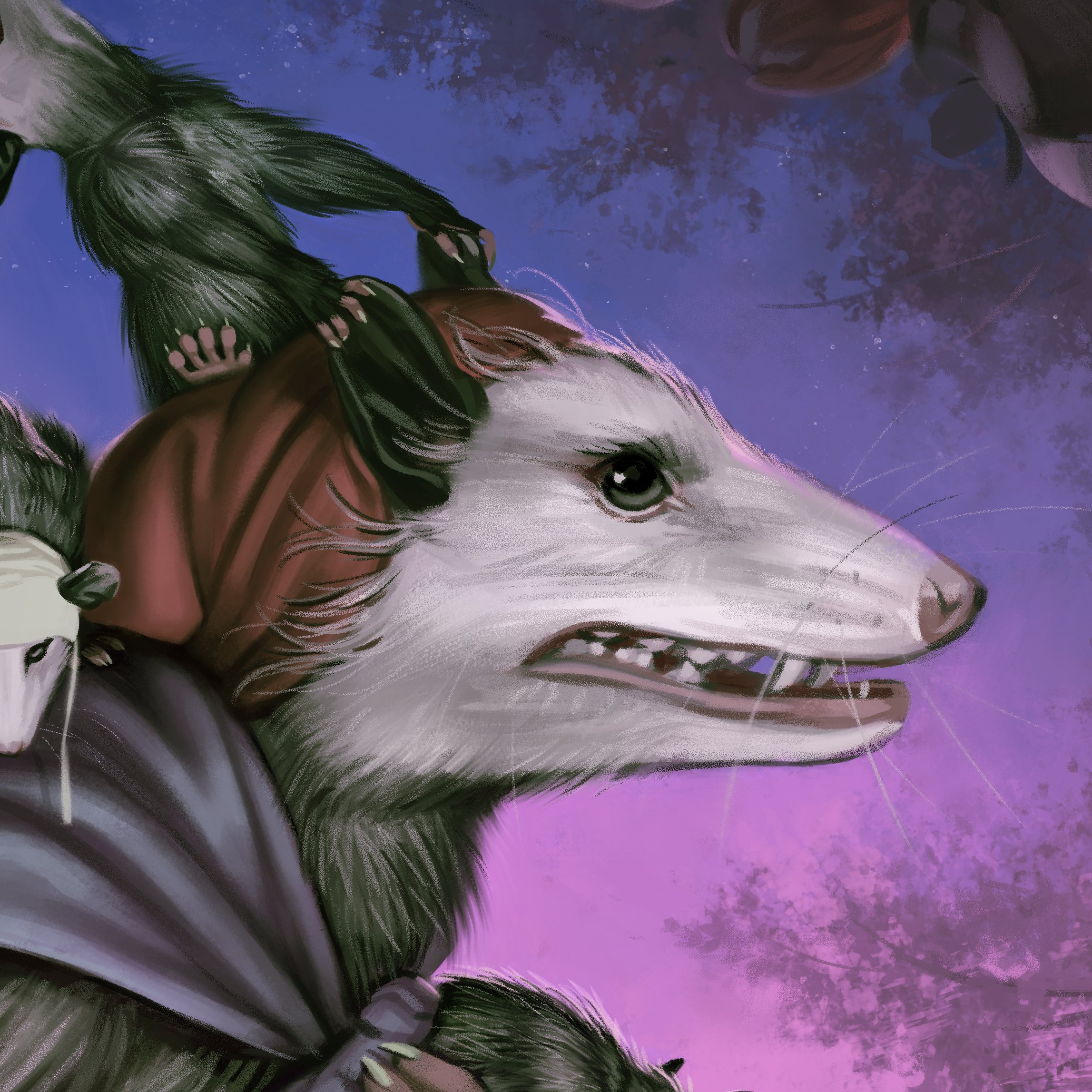
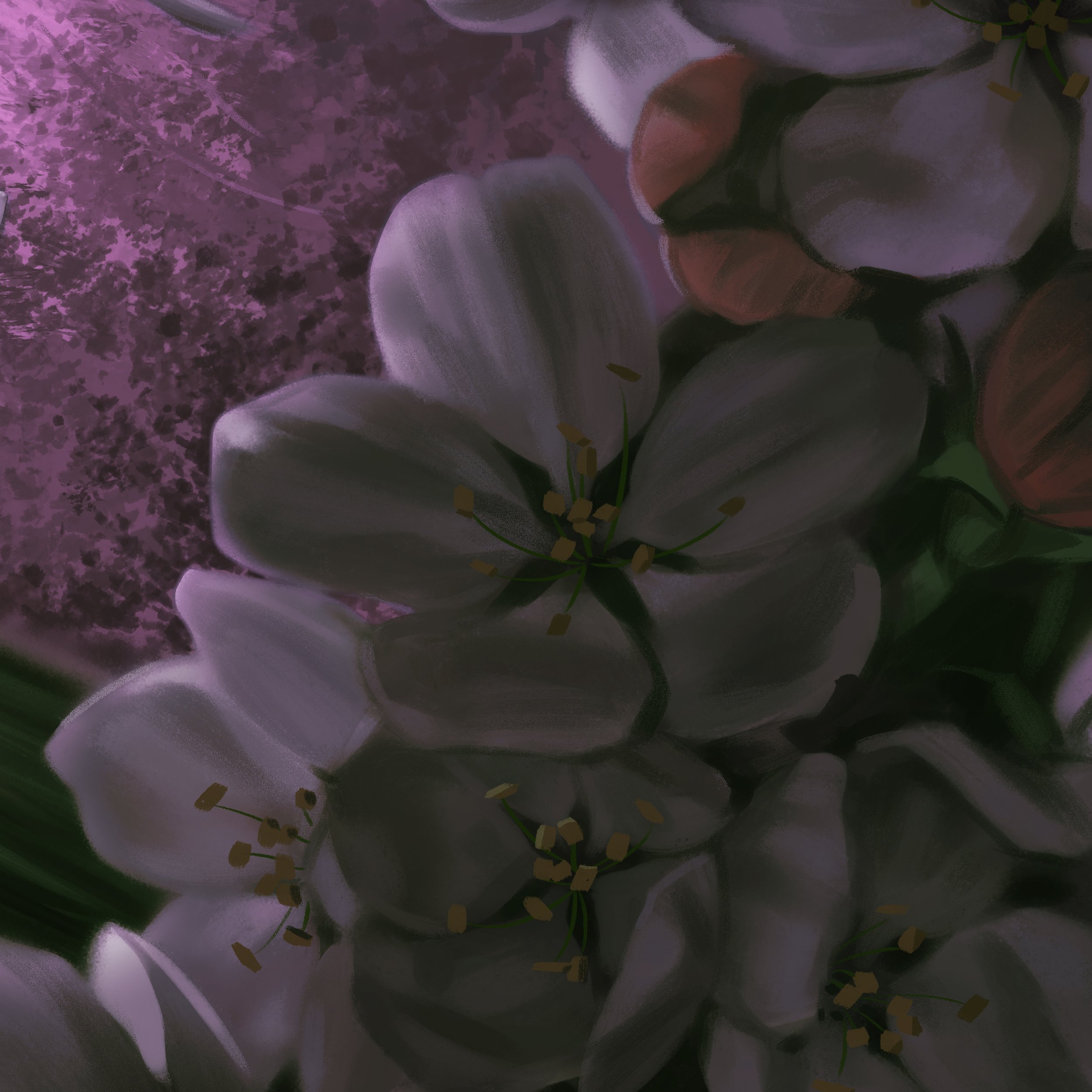
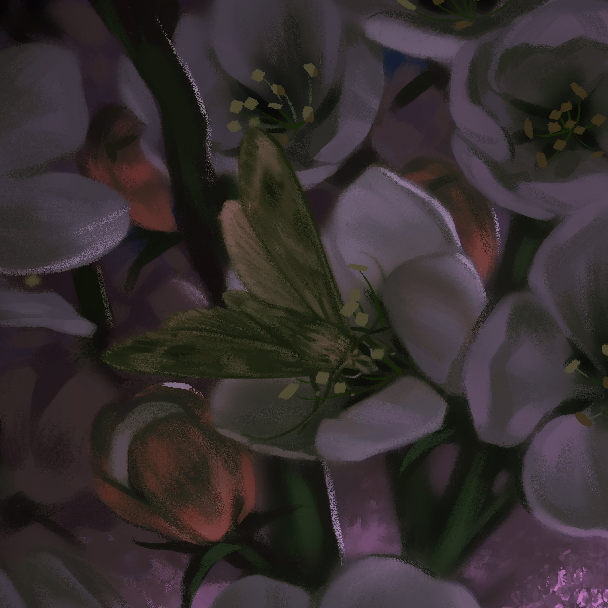
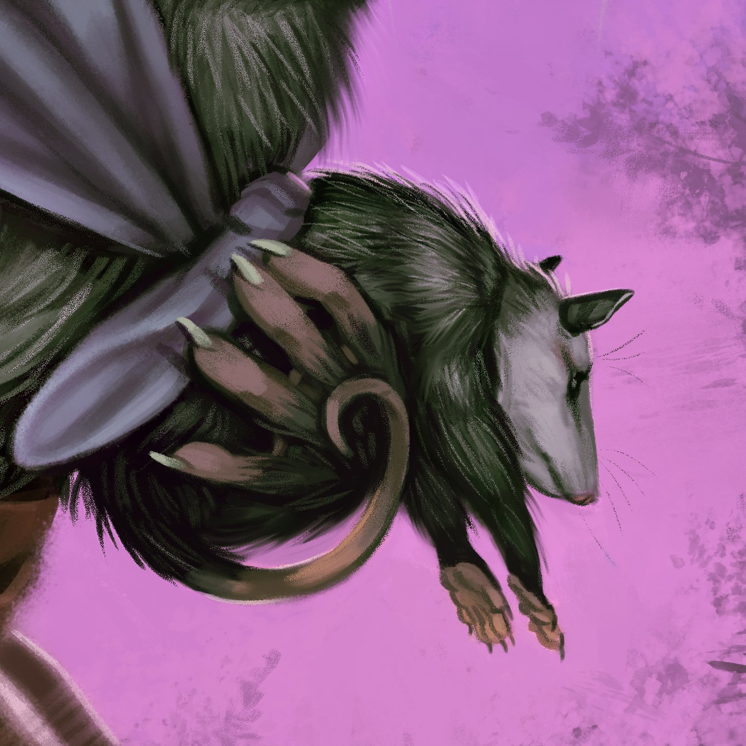
"A Possum Mom" celebrates the amazing marsupial of North America, the opossum, and moms everywhere! I kept in mind the spring timing of Mother's Day and was generous with the blossoms.

I am taking an exciting step in my art business by opening an online store integrated directly into my website! It will launch in about a week on April 24 and will coincide with some deals! I will send out a special newsletter with the launch and a special discount code.

Creating a Dramatic Backdrop

Backgrounds are sometimes an afterthought for illustrators, but they have huge narrative importance. The background gives valuable information on the story, provides the lighting situation, and helps drive the visual flow throughout the composition.

The cover I illustrated for Merrow Crescent tackles a number of visual challenges. Lets see how I got there!

The story for Merrow Crescent revolves around a girl and her encounter with unicorns (disguised as horses) at a relative's farm. There are a few must-haves for a Middle Grade cover, such as featuring the protagonist. For fantasy, depicting a magical creature or undeniably magical element is also a must. That helps me narrow down my options, which is a blessing because there are simply way too many directions to go in if we keep any and all concepts on the table.

My client provided me a loose sketch beforehand which I used for the second thumbnail. The other two concepts are similar to the client's concept in that they create a contrast between the unicorn with a rural setting.

We moved forward with the second sketch to explore color schemes and typography.

My goal for color was to bring out the hot red of the magic staff by using cooler background colors. This also informed the cool and warm color scheme for the text.

For the font style of the title text, I tried out a few whimsical swoopy fonts as well as a western style for fun to see what it would be like to hint at the rural setting with the title and motifs.

After the font and color scheme was approved, I moved forward with my reference gathering to try and recreate the complex scene from the sketch.

The reference gathering involved some hands-on 3D modeling in Blender. The first challenge was to find a 3D model with the right style of stable. I found a free model on the Google Sketchup 3D warehouse, which I customized to fit the structural and lighting needs for the artwork composition. I took the stable and duplicated it twice so that there were three long hallways to match the size of the maze-like stable described in the story. I narrowed the middle hallway that the figures occupy, otherwise they would stand too far apart on the book cover. There were a few other adjustments here and there, but the big one was making skylights, which I made using a Boolean Modifier to quickly cut out a square for each window hole. It took a little bit of trial and error to make sure the placement of the skylights and angle of lights in the 3D scene matched the sketch.

Here is the main 3D render composite that gave me invaluable information on the complex lighting. As you can see the models aren't perfect--the "wizard" doesn't have all of his fingers and the background figures are three bald amigos--but it's enough for lighting reference.

When I was playing around with the camera in Blender, I was rotating it (mostly by accident) and saw how cool the Dutch angle looked. I revised the position of the text on the back cover and ended up with what a more suspenseful image and better formatting of the text because of the tilted horizon line.

The final paperback cover and typography for Merrow Crescent!

Last Day for Holiday Gifts: December 16

Here's your heads-up for purchasing physical gifts from my Etsy store. Make sure to get in your order by December 16 to have it shipped in time. There may be some slight variations depending on your location, so you can look at the delivery estimate right on the Etsy listing. I have stickers, framed artwork, prints, and more!

Here Be dragons and Illustration Resources

Fantasy illustration is all about picturing things that don't exist (like dragons), which begs the question of how to create a sense of realism. The book cover I designed for A.P. Couiteaux is a good example as it melds elements that do exist in the real world with the fantastical.

This book was just released on Kindle. Check it out if you like fantasy with a spice of sci fi.

After reading through the novel and discussing composition goals with the author, I created my typical three sketches. This cover is a full spread, which is an exciting “landscape” aspect ratio to work with. My task is to make sure the art works when cropped to just the front, but still has a nice visual flow from back-to-front.

The preliminary concepts:

Even from the earliest sketches, I found it helpful to have placement for the title text, turning the layer on and off when I wanted to focus just on painting. The final composition (below) combined two concepts from the preliminary sketches, focusing on the first sketch and incorporating the back side of the second sketch.

Now comes the challenge of fitting all of the text elements without creating clutter.

Below is the final text layout, color scheme, and art composition. This is important to do before polishing the artwork. There is less worry if a major change needs to be made during the sketchy stage to accommodate text. This layout is for hardcover, hence the interior flaps.

Now I am ready to dive into gathering photo reference. My aim for reference is to learn about the structure of lighting and anatomy that will inform my artwork, but not by pursuing "detail" in the traditional sense of realism. I enjoy realism that focuses on mood over detail, just like a Pixar movie can have "cartoony" 3D characters that feel life-like.

Let’s dive in to one of my favorite resources: 3D models!

I like to use 3D models for most of my reference, which I might build from scratch if it’s really simple, but most often I combine and alter existing models from free 3D model websites. The only big challenge for 3d model reference is getting natural-looking clothing folds, so I will usually take a few selfies for that.

I construct, add lighting, and render images using Blender (also free). Blender is not an easy software to use, but if you are opening existing models and adding a few light sources, you only need to learn a few tools inside the program.

Here is a look at the Blender interface. Eve says hi.

 Here is a more complete list of the free resources I use for my reference, they are:

  • Blender

    My main 3D modeling software

  • Daz3D

    another 3D modeling software more focused on posing human models. Not as comprehensive as Blender, but more user-friendly

  • Mixamo

    Auto-rigging for your humanoid models to then pose in Blender. Also has a couple of free character 3D Models

  • Sketchfab-

    My favorite website for free 3D models. They have a 3D viewer, which is nice for quick reference as well as downloadable models

  • Quixel

    A really amazing library of 3D scanned models. I haven't tried this one yet, but it's on my radar. Requires an add-on to import the files to Blender

  • Grabcab

    A great website for more technical 3D models, like vehicles and furnishings. Not the best for downloading (file conversion needed), but has a built-in 3D viewer

  • CGtrader

    A smaller selection and not as high quality as sketchfab, but free is free. Account required.

  • Turbosquid

    Another free 3D Model option. Account required.

I don’t always shy away from paid 3D models. If it saves you time, it’s worth every penny and you can probably use for future reference as well.

A pro tip for rigging non-human, imaginary creature 3D models like dragons: skip the rigging. I find it faster to cut up the model in sections and just rotate limbs to the desired angle for the pose. The wings I used for my dragon (which actually do need to be rigged) come from a pre-rigged bat model. Some mythical creatures are more or less real animals with added components, like unicorns. Just stick a horn on that horse. Work smarter, not harder.

Here is the final spread for Eve Archer! Online 3D models and other virtual resources are more abundant than ever and give you a great degree of control and creativity for implementation.


Fantastical Art for Your Fantastical Friends!

If you haven’t heard: I have originals, prints, stationery, and more goodies on my Etsy Store with Cyber Weeks Sales happening as we speak. Check out my store for all the details.


Crafting a Steampunk World

Etsy Cyber Week Sales

First things first: prepare yourself for holiday sales. Etsy has unique, hand-made trinkets for the holidays and great deals during "Cyber Week" following Thanksgiving. I will have a 20% off sale on my Etsy store and a few new goodies to check out! Use the Code "cyber2022" during November 18-30. You might want to visit my store before then because I do have new physical greeting cards-- one featuring my Thanksgiving Fox and Goose just in time for turkey day.

Crafting A Steampunk World

Alternate history is a curious sub-genre of sci-fi and is perhaps most well-known in popular culture through stories of zombie apocalypse, dystopia, and...steampunk! This is one of my favorites to illustrate because of the fantastical over-the-top nature of it with flying ships and flamboyant victorian garb.

Cover illustration for book 1 of The Duchess.

This particular middle grade novel I illustrated for encapsulates all of the typical steampunk motifs, so you better bet there will be some goggles and dirigibles. It was also important to capture the bond between the two sister characters, as illustrated in the prelim sketches below.

The author, Jeremiah Brennan, liked the third sketch most for the cover, which makes perfect sense. It best captures a scene from the narrative and the circular visual flow portrays the chaos of this steampunk port. In a stroke of good fortune, Brennan was also pleased enough with the second sketch to commission a full interior illustration based on it.

Above are the three options for the cover text. Fortunately for us, the Victorian era has a very defined design aesthetic, which also happens to be popular, meaning there are plentiful resources for looking up Victorian signage and learning what fonts to use. Because so much of this story occurs on air ships, I also tried to bring in traditionally nautical elements (the flag in the first sketch's title, the scroll in the third sketch's title, swoopy bold script fonts).

With a relatively complex cover, I gather reference like a squirrel stashing winter acorns. The above left image is my composite reference for the interior illustration and the above right image is for the cover. I am using Blender as my 3D software as per usual with most of the models coming from Sketchfab. When I render a scene in blender, I will usually isolate different sections (foreground, middle ground, background). Not only is this helpful for tweaking elements when making a composition, but it also renders the 3D image in Blender much faster.

Pro-tip for scenes with crowds: check out 3D scans of statues. Statues are wonderfully expressive, so you are less likely to need pose the 3D scans and go through the rigmarole of rigging. Let’s just call it rig-marole, shall we?

The finished black and white interior illustration with the Duchess piercing the clouds.

There is more to the adventure yet! Brennans commissioned chapter artwork for The Duchess as well. This gave me the opportunity to further develop my “interior” drawing style, which utilizes contour lines inspired by the likes of Charles Dana Gibson and Franklin Booth. I am excited to develop more artwork like this, which feels true to the way I draw in my sketchbooks. If I am drawing more like how I sketch, the result is a more cohesive voice to the artwork.

Brennans went all in with a separate design for hardcover. We tried a vintage, graphical approach, which is perfect for this genre. I sent another three concepts.

Here is the ship I used to render the interior illustration and hardcover. It’s a mishmash of an existing model and some of my editions. It’s not perfect, but it does the job. Small elements like the ship rigging I can draw without a precise model, so I’m not worried about the model on a detail level.

The finished design is elegant and textural for a collectible appeal. Physical book sales are a different animal with the rise of ebooks. People are looking at books for decoration first and reading second. Just take a look at Barnes & Noble collectible editions with effects like embossing and foil stamping. This attempts the same feel of a collectible edition with a faux finish.