Procreate Vs. Photoshop Part 2

Last month I shared about some adventures in Procreate from the perspective of a Photoshop user. I have a few more insights to add and some conclusions that surprised me!

Reference photo from photographer Engin Akyurt. Brush comparison in Procreate. Re-shading the same sketch with different brushes is a great way to see their qualities!

My original goal was to recreate the feel of Photoshop in Procreate, but I also found that I liked Procreate for different uses. With the above study, I tested out two brushes that I liked after a lengthy narrowing-down process. The left example was made with a gouache style brush with the hopes of finding something like the Kyle gouache brushes for Photoshop. The right example was made with a brush from the Jingsketch Basics pack that I had used and was a little intimidated by at first, but had noticed potential. I stuck with it and enjoyed using it so much that I decided to pursue this smooth, art deco flavor with an additional study!

The Edge Control brush is one that could only work well in Procreate. The brush dynamics that make it so fluid and have a controlled, but organic taper from the hard edge to the soft edge would not work in Photoshop. Procreate excels at line-based brushes, so it's no mystery that comic artista love it. It is also useful for the contour control needed for modern/art deco styles and calligraphy. 

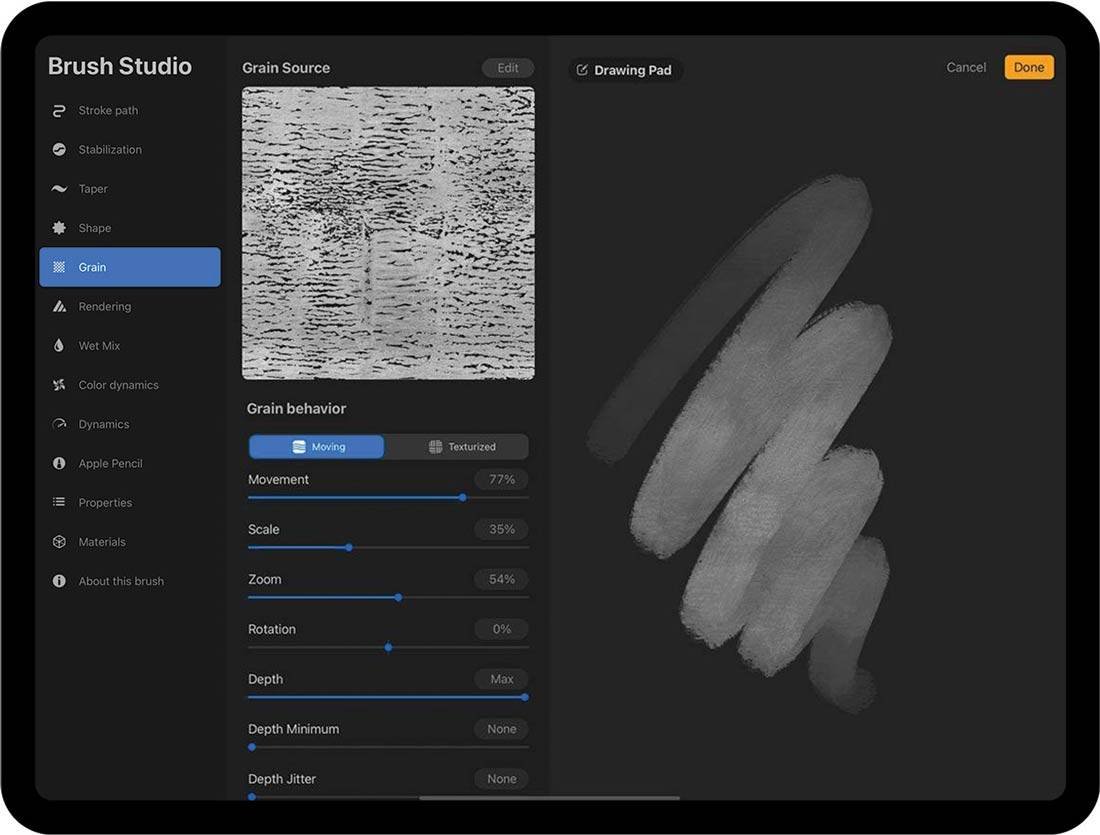
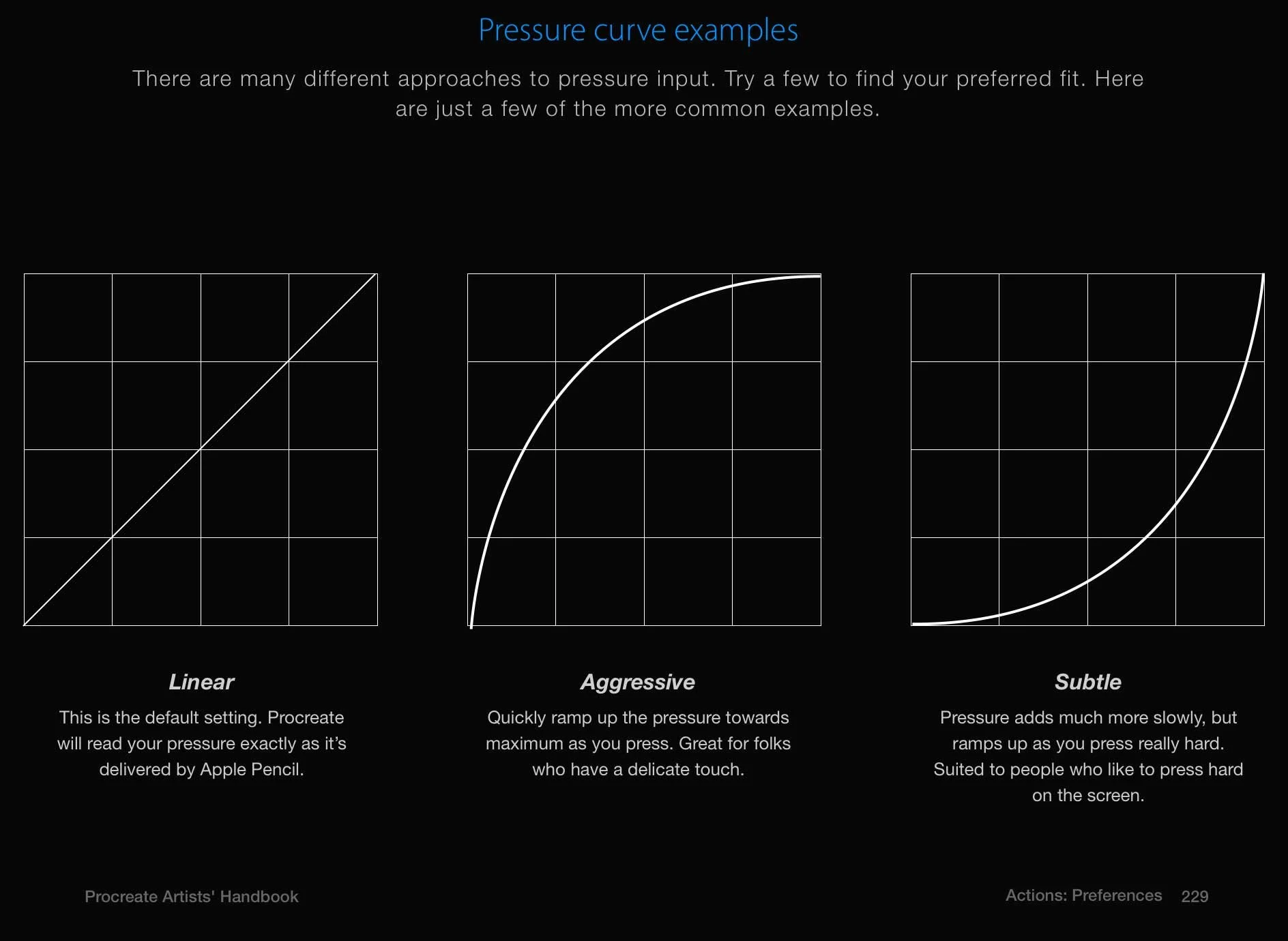
Above are the brush settings for Procreate and wow-eee are there a bunch of toggles. The number of brush features on the left side seems to be about the same as Photoshop, but within each feature, there are a greater number of settings. Finding a pre-made brush you like and messing around with the settings a little is more approachable than building a brush from scratch.

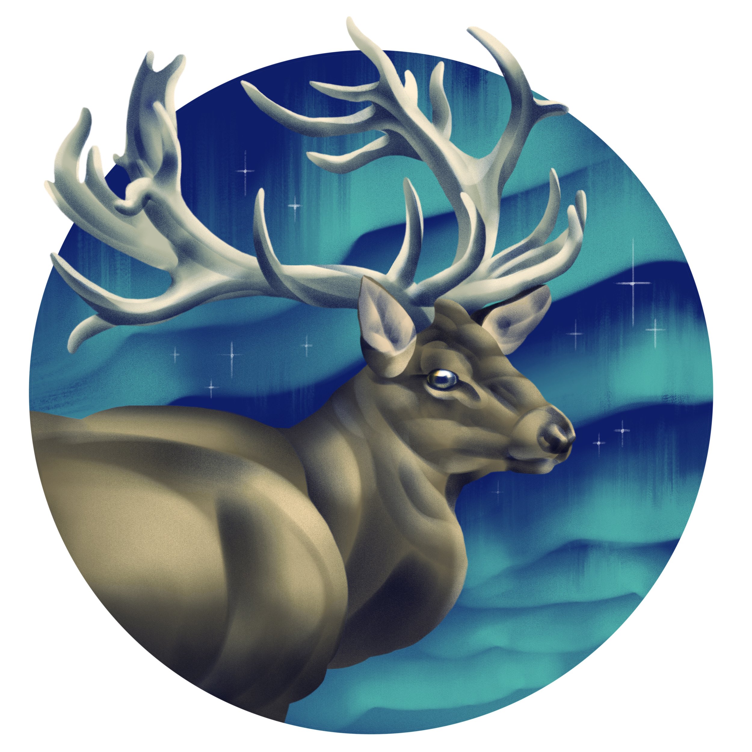
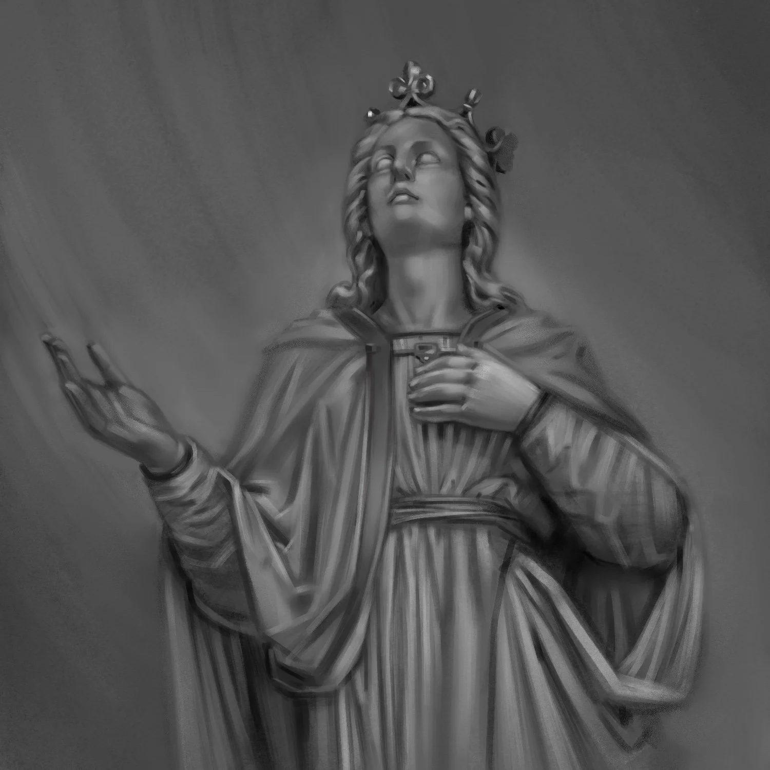
A painting study in Procreate using Jingsketch's Edge Control brush.

Here is the second attempt with the Edge Control brush to see if I could make a more polished illustration with it. The plane-defining nature of the brush called for a graphic approach and informed the direction of the composition. The shading style for this elk gave some freedom to exaggerate shapes while also being systematic in a way that feels natural for how I like to build shadows and highlights. 

In conclusion, Procreate and Photoshop have the same basic structure, but have unique strengths depending on the use. For my purposes, Procreate is amazing for sketching and encourages me to experiment more. I can't sit in bed or at a cafe with my massive iMac and do photoshop sketches, but I can take the iPad anywhere and fill my time with drawing when I might otherwise melt my brain with social media. While Photoshop is also available for iPad, the interface for Procreate is well-suited for a small device. Photoshop has better tools for the complex illustrations I make for my book covers and posters, such as vector shapes, photo-editing tools, and typography options. I went in thinking I could recreate my same Photoshop techniques in Procreate and came out with a completely different approach for illustrating!

As a side-note and public service announcement, another tool has become available for protecting artists and their copyrighted images against AI plagiarism. It is called Nightshade, which is made by the same team that made Glaze. Nightshade deters the unethical scraping of copyrighted images by making very small changes to the pixels of your images. AI training models will go on to ascribe the wrong description to the “Nightshaded” images because of those changed pixels, weakening the model. Hopefully, this will help AI developers understand the importance of training on copyrighted data through consent.

Crafting a Steampunk World

Etsy Cyber Week Sales

First things first: prepare yourself for holiday sales. Etsy has unique, hand-made trinkets for the holidays and great deals during "Cyber Week" following Thanksgiving. I will have a 20% off sale on my Etsy store and a few new goodies to check out! Use the Code "cyber2022" during November 18-30. You might want to visit my store before then because I do have new physical greeting cards-- one featuring my Thanksgiving Fox and Goose just in time for turkey day.

Crafting A Steampunk World

Alternate history is a curious sub-genre of sci-fi and is perhaps most well-known in popular culture through stories of zombie apocalypse, dystopia, and...steampunk! This is one of my favorites to illustrate because of the fantastical over-the-top nature of it with flying ships and flamboyant victorian garb.

Cover illustration for book 1 of The Duchess.

This particular middle grade novel I illustrated for encapsulates all of the typical steampunk motifs, so you better bet there will be some goggles and dirigibles. It was also important to capture the bond between the two sister characters, as illustrated in the prelim sketches below.

The author, Jeremiah Brennan, liked the third sketch most for the cover, which makes perfect sense. It best captures a scene from the narrative and the circular visual flow portrays the chaos of this steampunk port. In a stroke of good fortune, Brennan was also pleased enough with the second sketch to commission a full interior illustration based on it.

Above are the three options for the cover text. Fortunately for us, the Victorian era has a very defined design aesthetic, which also happens to be popular, meaning there are plentiful resources for looking up Victorian signage and learning what fonts to use. Because so much of this story occurs on air ships, I also tried to bring in traditionally nautical elements (the flag in the first sketch's title, the scroll in the third sketch's title, swoopy bold script fonts).

With a relatively complex cover, I gather reference like a squirrel stashing winter acorns. The above left image is my composite reference for the interior illustration and the above right image is for the cover. I am using Blender as my 3D software as per usual with most of the models coming from Sketchfab. When I render a scene in blender, I will usually isolate different sections (foreground, middle ground, background). Not only is this helpful for tweaking elements when making a composition, but it also renders the 3D image in Blender much faster.

Pro-tip for scenes with crowds: check out 3D scans of statues. Statues are wonderfully expressive, so you are less likely to need pose the 3D scans and go through the rigmarole of rigging. Let’s just call it rig-marole, shall we?

The finished black and white interior illustration with the Duchess piercing the clouds.

There is more to the adventure yet! Brennans commissioned chapter artwork for The Duchess as well. This gave me the opportunity to further develop my “interior” drawing style, which utilizes contour lines inspired by the likes of Charles Dana Gibson and Franklin Booth. I am excited to develop more artwork like this, which feels true to the way I draw in my sketchbooks. If I am drawing more like how I sketch, the result is a more cohesive voice to the artwork.

Brennans went all in with a separate design for hardcover. We tried a vintage, graphical approach, which is perfect for this genre. I sent another three concepts.

Here is the ship I used to render the interior illustration and hardcover. It’s a mishmash of an existing model and some of my editions. It’s not perfect, but it does the job. Small elements like the ship rigging I can draw without a precise model, so I’m not worried about the model on a detail level.

The finished design is elegant and textural for a collectible appeal. Physical book sales are a different animal with the rise of ebooks. People are looking at books for decoration first and reading second. Just take a look at Barnes & Noble collectible editions with effects like embossing and foil stamping. This attempts the same feel of a collectible edition with a faux finish.