Time really flew by this past month following the Reception at Press Coffee. Here I am at the Reception looking exhausted, exited, and full of nerd energy. It was a great show and it was so awesome to interact with folks who have similar tastes in strange and whimsical fantasy art.
I have some big art updates, so the focus this month is to catch you up on all the book covers I wrapped up! I will be able to dive deeper behind the scenes in the next newsletter.
My cover art and typography design for middle grade adventure novel, Serenade of the Sasquatch. This is the first book to be published for Ann Wyld books, a new middle grade imprint for this indie publisher.
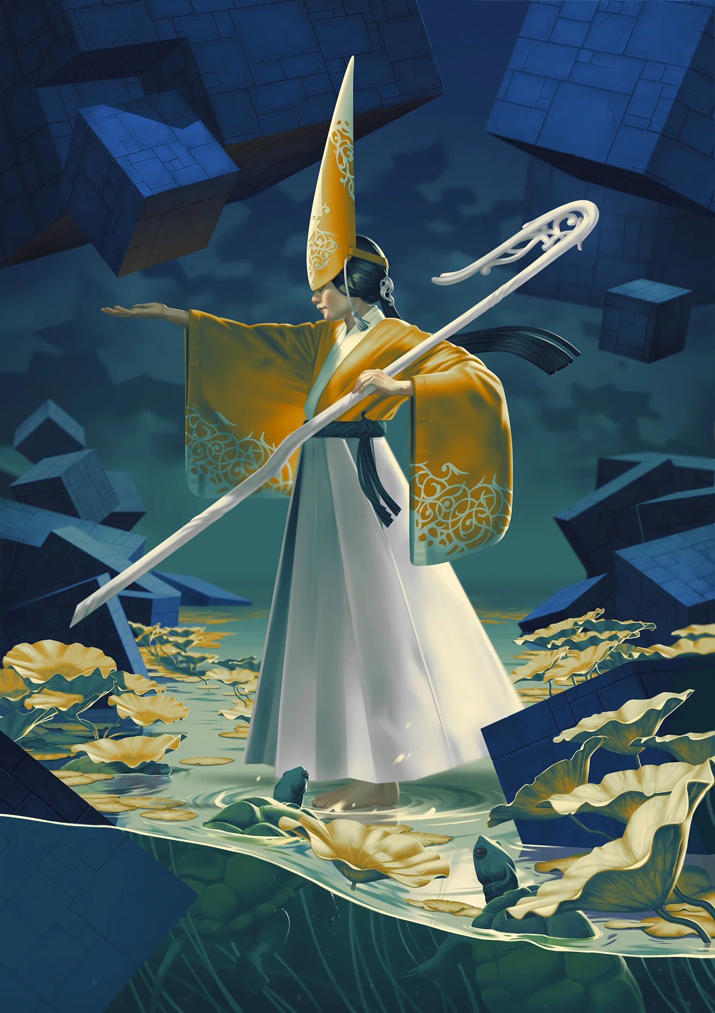
This is a fun cover I did for a spiritual Sci Fi book that was a long time coming and will be released June 3. I loved being able to focus on a colorful pattern and non-human subjects.
Princess Rouran is YA fantasy that features a twist on Chinese mythology. Another dragon cover? Yes please!
My most recent cover finished for The Preserve for Enchanted Creatures. Amanda has a kickstarter for the book here. The artwork for this cover had quite a daring color scheme, but I am quite pleased with the results!
Next up, I will have another local Iowa City show, this time with Artifactory from August 22-September 18. Reception time TBA!